Knytt Technologies

Knytt Icon

Knytt Background

Knytt Technologies is a brand new company based out of Denver Colorado with the mission to become a single platform used by businesses and groups to host all of their engagement and communication needs. The idea is that there are far too many tools for various communication tasks in the world today, and people need a single application where they can consolidate all the different forms of communication with ease. The Companies founder and owner, began working with Raio in the very early stages of his development for his vision. 

Original Site (former name)

What was needed

While an Engineering team was building the Application, Knytt needed numerous things designed in order to get off the ground. Because this app was pursuing a competitive field, Knytt needed a slick original look that would stand out from the crowd and be welcoming to the target audience. The biggest thing Knytt needed was a new website, as the original site was not suitable. Other things Knytt needed was a brand guide, pitch deck, many different graphics, as well as company emails, and domain hosting. Some of these things are showcased here on this page.

Outcome

The New Knytt Website

The new Knytt website needed to convey Knytt’s core message and the versatility of the application. It’s informative and will guide the viewer to see what Knytt has to offer them, as well as where they can download the application.  Visit the whole site here

Brand Guideline Static Webpage

Because this was a new company, Knytt’s founder also requested that we create a formal Brand Guideline. At Raio, we like to do these as static webpage’s, because we feel it provides a very necessary amount of flexibility when distributing and updating the guide itself. To visit the entire guide, visit this link here

Knytt Primary Logo

Brand Identity

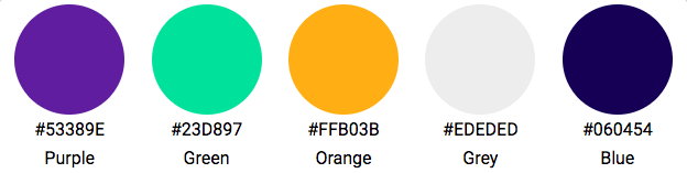
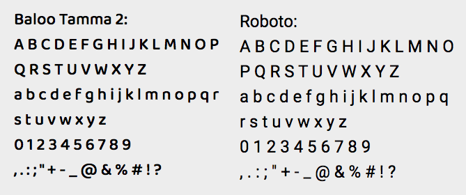
Knytts brand identity was something Raio developed from the ground up. The Knytt name and logo were inspired by the mission for the brand; knitting is the act of bringing things together, and the companies logo is meant to symbolize a needle and thread. The brands colors are highlight the brands desired attributes; these are friendly, energetic, high-tech, and adult. The main three colors, the purple, green, and orange, are the primary color pallet, as they provide excellent contrast to one another when used properly. The secondary pallet, the grey and blue, are meant to be used more quietly. Finally, the typography was selected intentionally to enhance the slick and modern feel of the brand, while still being very legible.

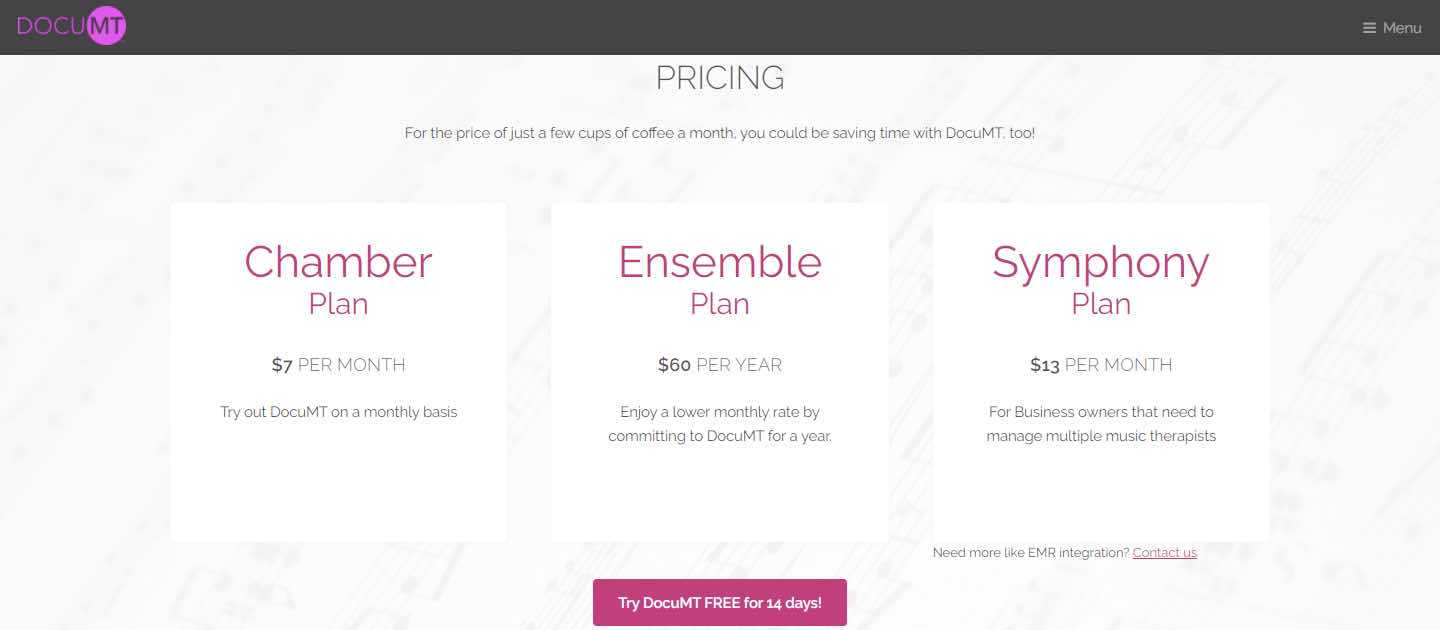
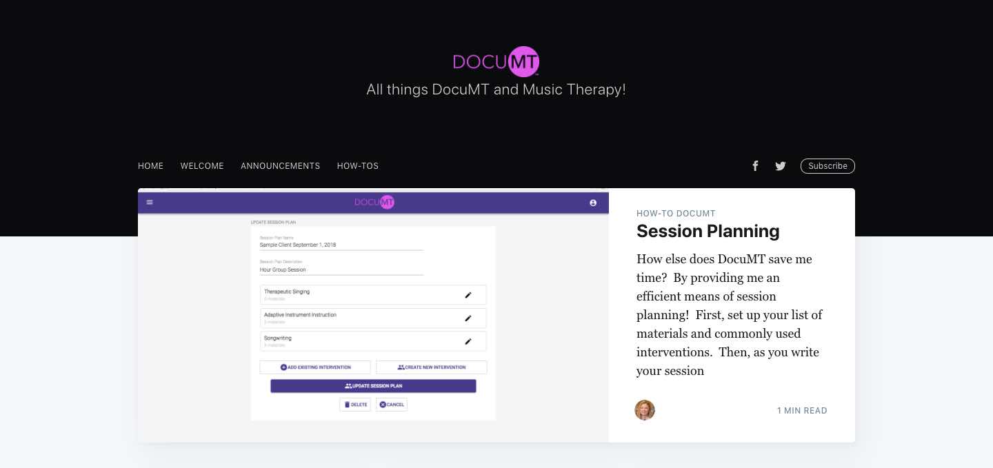
Various Graphic Design Work Raio's done for Knytt

Want a site like this one? Click here & connect with Raio!

Transitus

Transitus Icon

Transitus Background

Transitus is a 501 (c) (3) non-profit organization we’re a stoked to have the opportunity to work with. They design innovative programs to improve the access to food, healthcare, work, and sustainable education for all people in underserved areas. Their motto “lets bridge the gap” sums up exactly what the company is all about.

What was needed

Being new, Transitus needed a way to connect online with its various partners, showcase their mission,  as well as provide a virtual way for its supporters to donate to their cause. They needed a logo that reflected the brand and of course, a nicely designed website.

Transitus Icon

Outcome

The New Transitus Website

The “people bridge” logo above was largely inspired by the companies motto and mission. That is, bridging the gap for people and their needs.The new website is designed to inform the viewers exactly what Transitus is striving for. With many links and payment portals using stripe, its very easy for people to navigate the website, learn about what they’re all about, and donate to the cause if they so choose. The site does its job of highlighting campaigns, providing many calls-to-action, and remaining inviting. Check out the full site here

Want a site like this one? Click here & connect with Raio!

Food Forest

Food Forest Background

Based out of Cincinnati, Ohio, Food forest is a company founded on the belief that high quality fresh food should be for everyone, regardless of their income or address. Using their technology, they are bringing delicious name brand and local foods to peoples door with an easy to use application. They’re also a part of Krogers Zero Hunger Zero Waste initiative. All this said, we were really excited to get the opportunity to be a part of such a great cause.

What was needed

Food Forest is an ambitious company who have set their sights high on success. While working with an engineering team to build their application, they needed a compatible and intelligent brand identity as well as a website that accurately conveys the value’s of the company, all while remaining very profesional and modern.

Outcome

The Food Forest Website and Brand

The food forest website has been what feel is one of our greatest successes. The company is gaining excellent traction and the seamless integration of the website, brand, and application are a great part of this. Green is the Food Forest color of choice, as it reflects the freshness and whole-fullness of the food they seek to deliver. The logo, or the mirrored F’s, are a modern and stylish icon that is very recognizable and highlights the technological aspects of the brand. The site also showcases the application extensively, and has integrated downloads and sign up links throughout.  Overall the food forest site is very visually appealing and provided the call-to-action that the client needed for their product. Visit the whole site here

Want a site like this one? Click here & connect with Raio!

Iotery

Iotery Background

Iotery is a product/service created by the company Technicity. It essentially serves to make deploying and implementing IoT services much easier. It creates a scalable, flexible, and secure environment for IoT, and provides various other features to make IoT system architecture and maintenance simpler.

What was needed

Iotery needed logo, as well as a website that would be able to concisely depict exactly what Iotery is and how it works. Technicity hired Raio to design the brand Icon, as well as design a technologically heavy website for their new system. 

Outcome

The Iotery Website and Logo

To start with the logo above, we took inspiration from the big picture… Iotery is a platform designed to help simplify and consolidate a IoT system as a whole. Therefore, the prism came to mind. As the name implies, a prism helps narrow the focus of a stream. In this case, the stream is IoT system processes. Running with this, we created a website that concisely depicted what Iotery is and what it does, in a modern, informative site. For this site, we also embedded registration forms and login portals for all current and future Iotery users. Check out the full site here.

Want a site like this one? Click here & connect with Raio!

Modesto Labs

Modesto Labs Background

Modesto Labs Is an international engineering solutions firm that provides innovative solutions and strategies to keep businesses moving forward on their best path. Using their services and years of experience in the field, businesses are able to implement better plans, or simply get their ideas off the “whiteboard and into production.

What was needed

Modesto is another of our clients specializing in professional consultation services. Because of this they needed a sleek, relaxed, and also professional identity and website. To achieve this, they hired Raio to develop their image, logo, vibe, and website.

Outcome

The Modesto Labs Website

The logo is simple and features cross-marks for style. The “eye” icon for the first “o” is meant to represent the trained eye and experience that the company provides for its clients. The Modesto Labs website is inviting, and provides a great balance between a relaxed and professional vibe. The site is very visually appealing, informative, easy to grasp, and provides simple navigation for the user to read and learn all about what they have to offer. Check the full website out here

Want a site like this one? Click here & connect with Raio!

DocuMT

DocuMT Background

DocuMT is technology company who is making it easier for Music Therapists to spend more time with their clients and less time doing administrative work. Their application allows Music Therapists to expedite planning, tracking, and documentation, all while working toward a better connection with their clients.

What was needed

While their product was being built, DocuMT connected with Raio in order to get their brand an overall friendly look and more importantly, a new website to host the information about their product. The website needed to be inviting, and needed to thoroughly explain the features of the product and its benefits for users. We also needed to integrate sign-up and purchase fields for the product.

Outcome

The New DocuMT Website

The new WordPress site for DocuMT provides exactly what they needed. A simple site, used to showcase their product and what it can do for music therapists everywhere. The site is designed to be informative, and welcoming, so that viewers are excited to reach out to DocuMT and seek out their products and services

Want a site like this one? Click here & connect with Raio!

Health QRS

HealthQRS Inc. Background

HealthQRS is a comany founded on making innovative retail solutions for patient out of pocket expenses, navigation,  and engagement. They believe that direct patient engagement is the sure way to effectively control healthcare costs, improve patient satisfaction, and improve overall financial performance. To do this, they’ve created their own innovative retail point-of-service, direct pay medical marketplaces, and white label branding.

What was needed

In order to jive well in their industry, Health QRS needed a brand identity that would shine true to with healthcare and where they came from. They also would need a professional website that would accurately reflect their solutions to each facet of the healthcare industry. They connected with Raio in order to achieve this desired outcome.

Outcome

The HealthQRS Website & Brand

The branding Raio delivered for HealthQRS is clean, classic, and professional. Blue and white are often colors used in healthcare, and it gives a the professional vibe they needed. The flight icon reflects part of what originally inspired the companies founder for the ideation of the company, as well as the goal for the company, as a whole. That is, providing exceptionally more efficient, faster, and effective service. The Website itself, showcased these values, and also provides clear direction for how these solutions can apply to each area of the healthcare industry. It is full of easy to understand navigation, as well as has many css customized download links for various materials. See the full site here.

Want a site like this one? Click here & connect with Raio!