Knytt Background

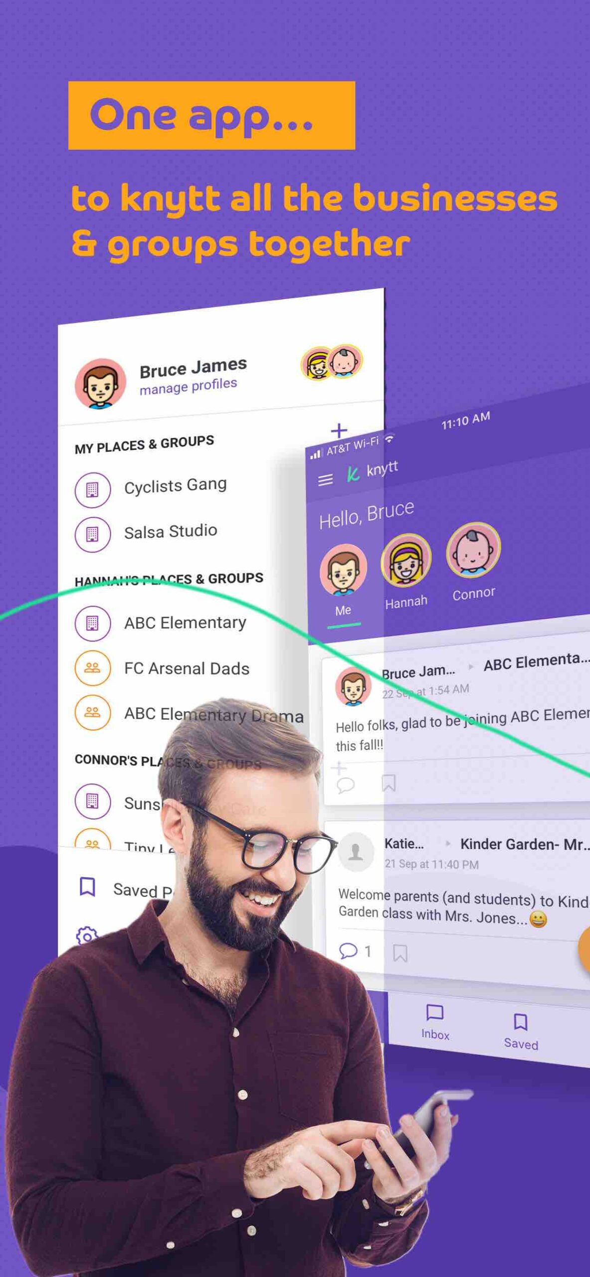
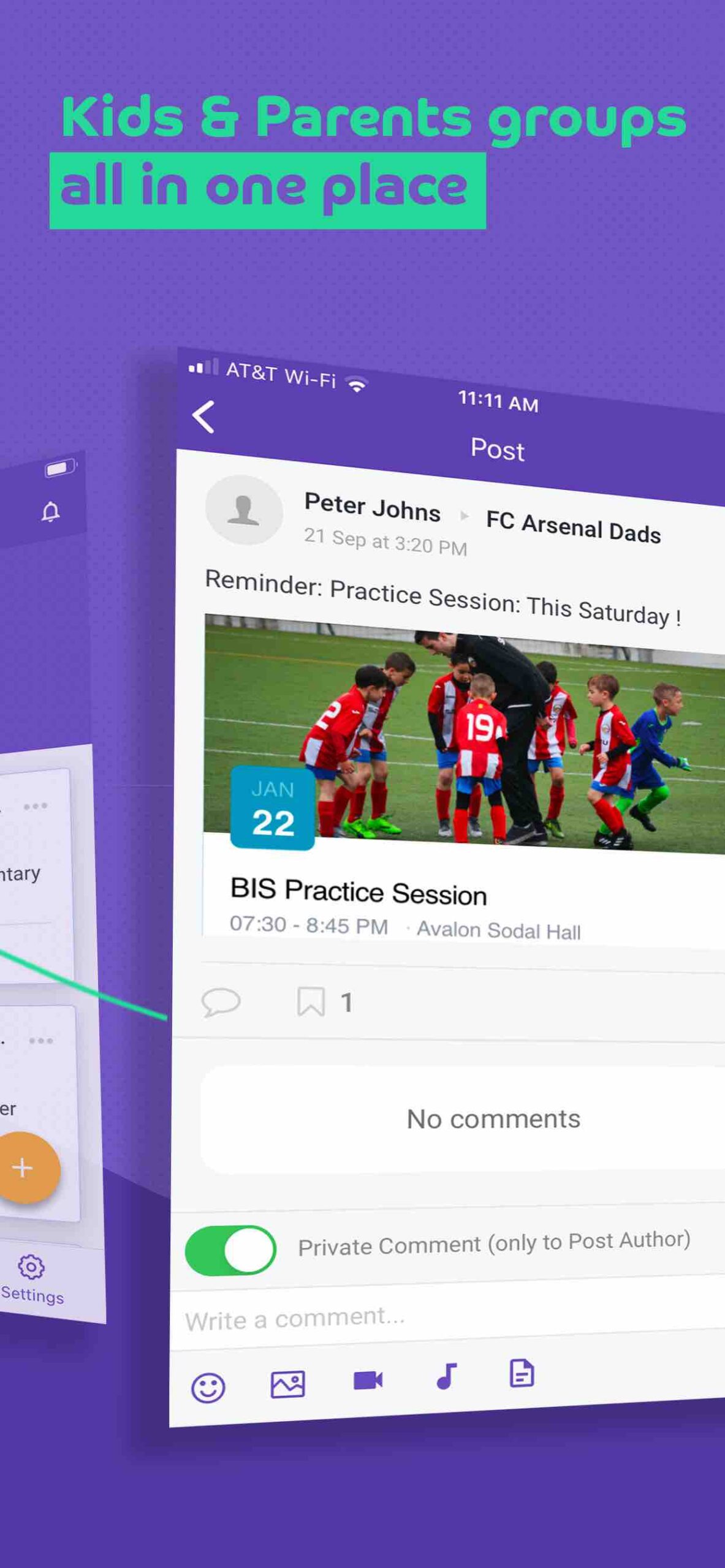
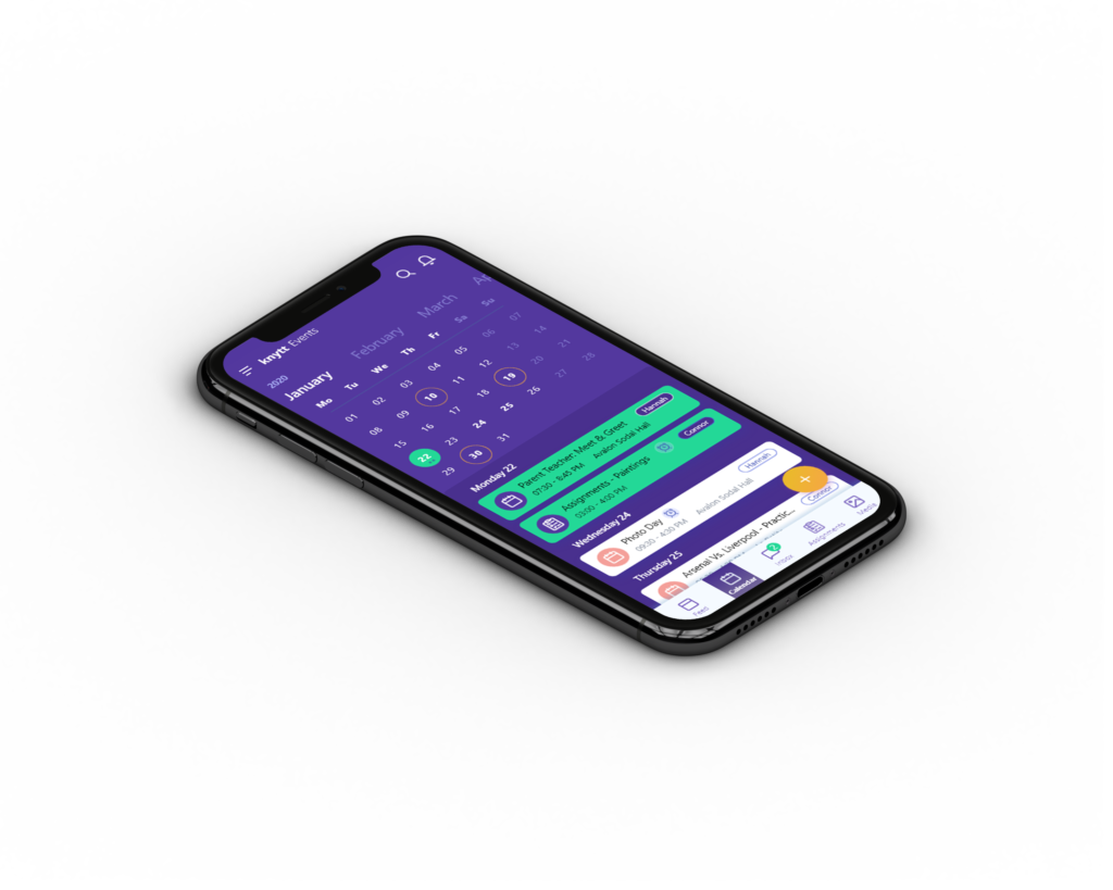
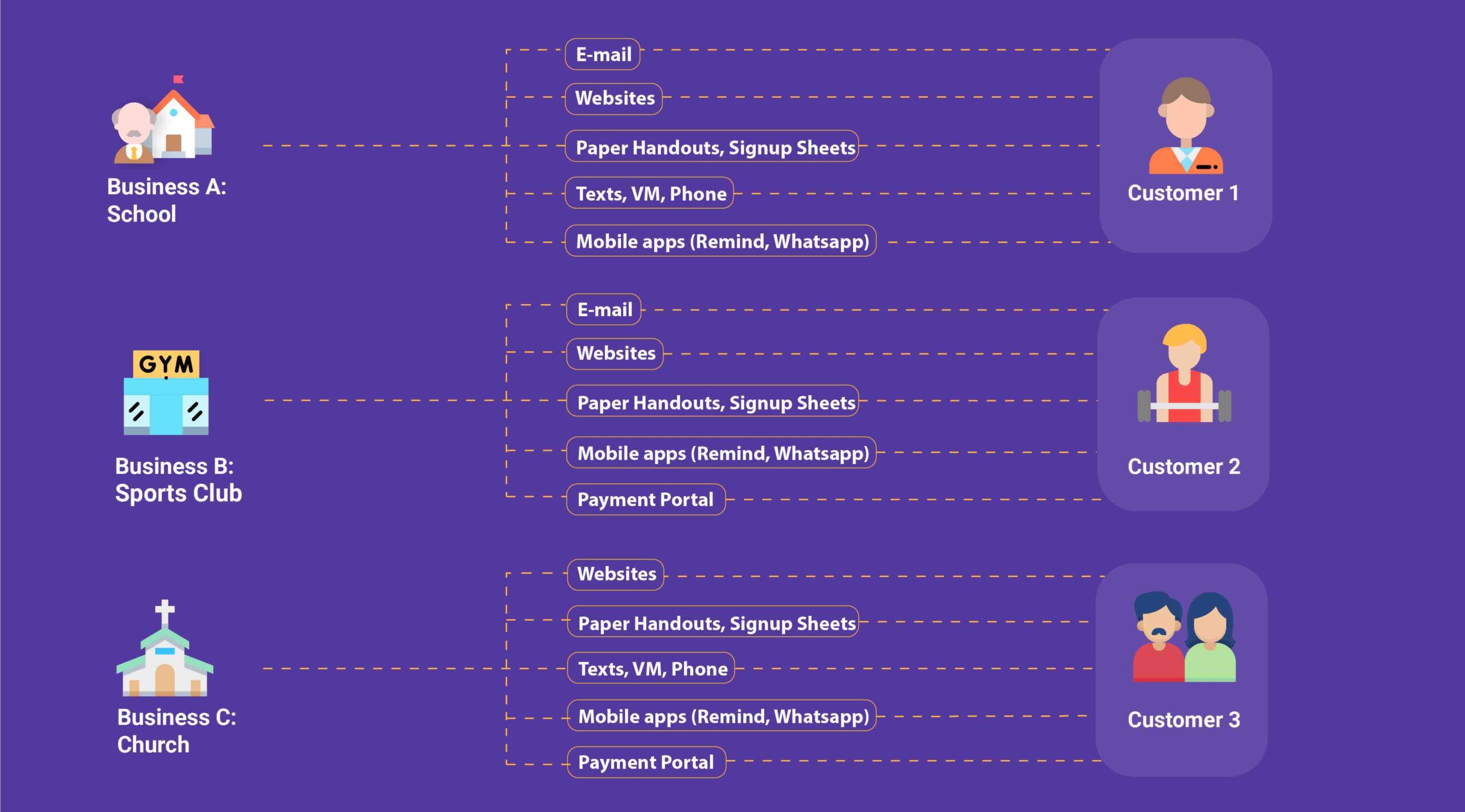
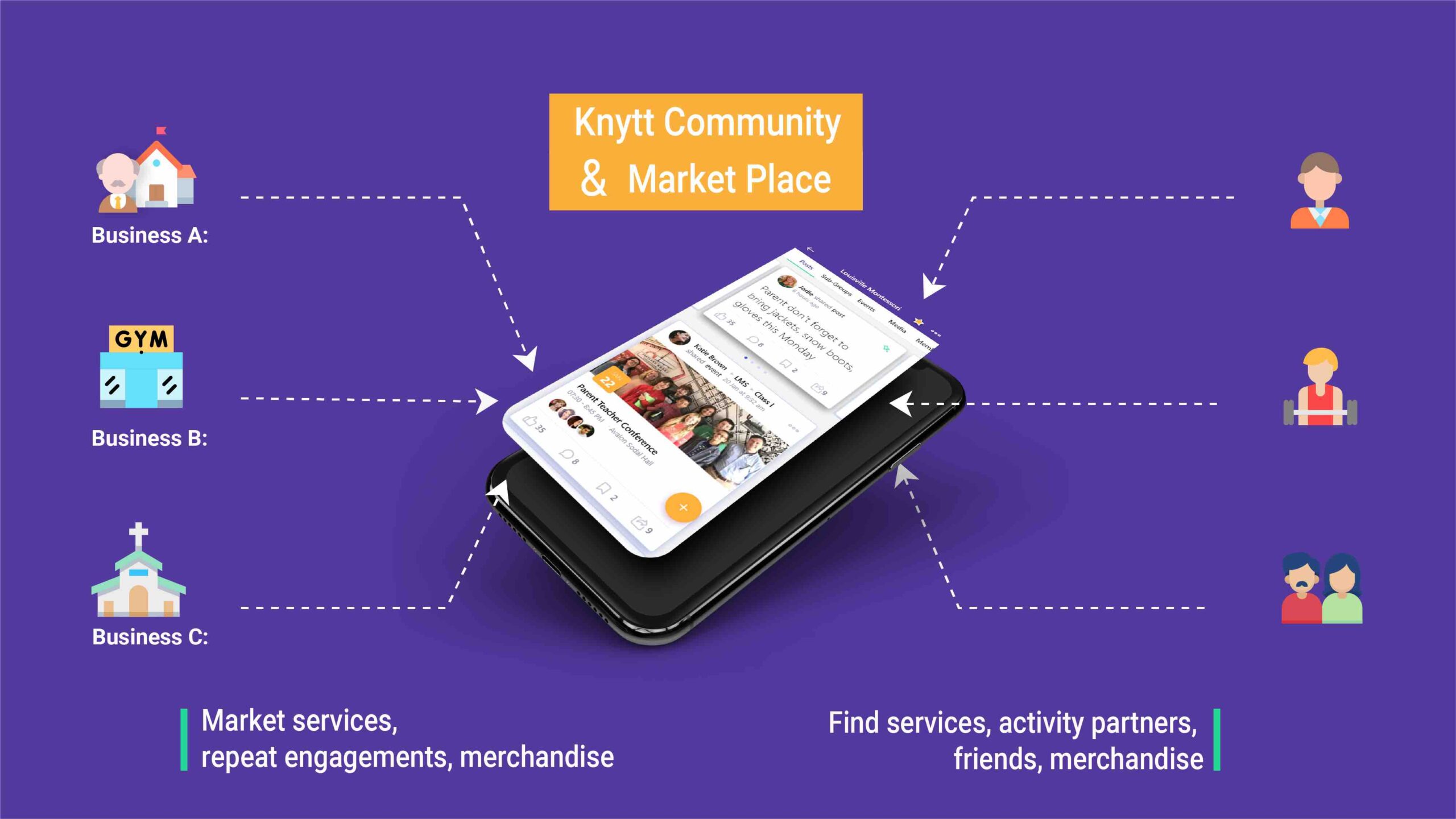
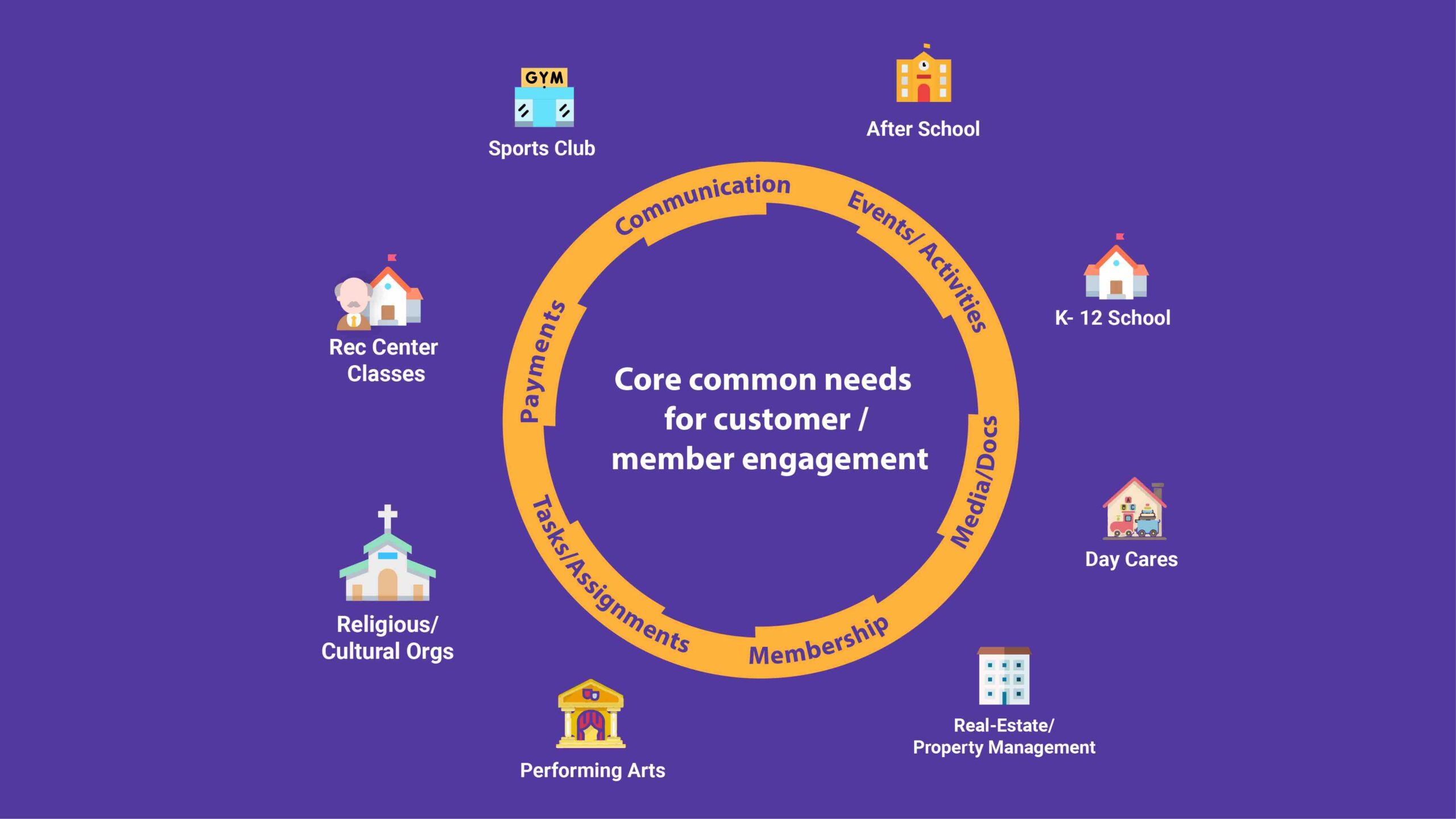
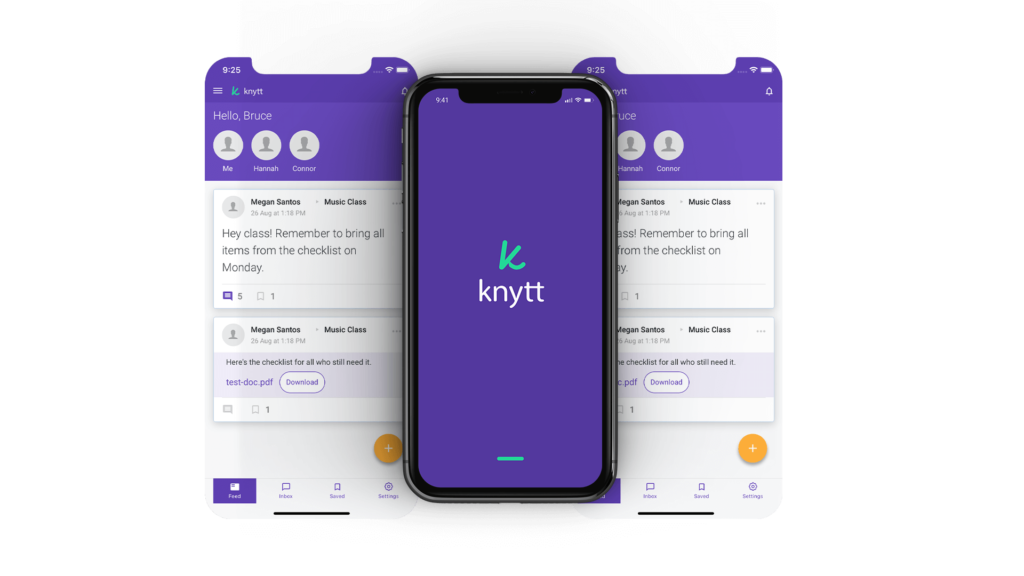
Knytt Technologies is a brand new company based out of Denver Colorado with the mission to become a single platform used by businesses and groups to host all of their engagement and communication needs. The idea is that there are far too many tools for various communication tasks in the world today, and people need a single application where they can consolidate all the different forms of communication with ease. The Companies founder and owner, began working with Raio in the very early stages of his development for his vision. 

Original Site (former name)

What was needed

While an Engineering team was building the Application, Knytt needed numerous things designed in order to get off the ground. Because this app was pursuing a competitive field, Knytt needed a slick original look that would stand out from the crowd and be welcoming to the target audience. The biggest thing Knytt needed was a new website, as the original site was not suitable. Other things Knytt needed was a brand guide, pitch deck, many different graphics, as well as company emails, and domain hosting. Some of these things are showcased here on this page.

Outcome

The New Knytt Website

The new Knytt website needed to convey Knytt’s core message and the versatility of the application. It’s informative and will guide the viewer to see what Knytt has to offer them, as well as where they can download the application.  Visit the whole site here

Brand Guideline Static Webpage

Because this was a new company, Knytt’s founder also requested that we create a formal Brand Guideline. At Raio, we like to do these as static webpage’s, because we feel it provides a very necessary amount of flexibility when distributing and updating the guide itself. To visit the entire guide, visit this link here

Knytt Primary Logo

Brand Identity

Knytts brand identity was something Raio developed from the ground up. The Knytt name and logo were inspired by the mission for the brand; knitting is the act of bringing things together, and the companies logo is meant to symbolize a needle and thread. The brands colors are highlight the brands desired attributes; these are friendly, energetic, high-tech, and adult. The main three colors, the purple, green, and orange, are the primary color pallet, as they provide excellent contrast to one another when used properly. The secondary pallet, the grey and blue, are meant to be used more quietly. Finally, the typography was selected intentionally to enhance the slick and modern feel of the brand, while still being very legible.

Various Graphic Design Work Raio's done for Knytt

Want a site like this one? Click here & connect with Raio!